Introduction
Transloco is the spiritual successor of
ngx-translate which is sadly now in
maintenance mode. It offers
the same features that made ngx-translate the go to library for Angular
internationalization - simple API, flexible translation formats and changing
languages dynamically at runtime. Transloco comes with its own ecosystem of
plugins and tooling which make internationalizing Angular application easier
than ever before.
Storybook is a modern tool for building UI components in isolation. It serves as a kitchen sink for UI elements and provides hands on documentation for developers. Initially supporting only React, developers can now use Storybook with all the mainstream UI frameworks - Angular being one of them. My prediction is that Storybook will continue to grow in popularity and will be an essential part of every front-end developer's toolbox.
In this article we will learn how to change the language of your Angular components using Transloco inside Storybook's UI. We will use the ability to extend the built-in toolbar of Storybook and add our own language selector dropdown. You can find the source code accompanying this article in this Github repository.
Set up a new project
Let's generate a fresh Angular project:
npx @angular/cli new transloco-storybook-integration --style=scss --prefix=evil-corp --strict=true --routing=trueAt the time of this article the latest Angular version is 12.2.1.
Install Transloco
Open the newly created project in your terminal:
cd transloco-storybook-integrationInstall Transloco as a dependency via their Angular CLI schematic:
npx @angular/cli add @ngneat/transloco --langs en,bg,es --ssr=false --skip-confirmationThis command makes English, Bulgarian and Spanish as the supported languages and turns off the server side rendering option. It also sets up everything needed for integrating Transloco into our project.
Install Storybook
Having our internationalization framework ready to go, we can proceed with installing Storybook.
npx sb initThe installation doesn't require any input on our side - it's smart enough to
figure out this is an Angular project and how to set the Storybook integration
up. The install script creates a new folder called /stories containing a
handful of demo components. Once you run npm run storybook and verify
Storybook launches, it's better to delete everything inside - we are going to
create our own component demonstrating the Transloco integration.
rm -rf ./storiesLeave the .storybook folder in the root of the project intact as it contains
essential configuration files for Storybook to operate.
Creating a demo component
Let's now create a sample status badge component which has translation strings rendered by Transloco.
-
Generate a new Angular module where we will put our components.
ng g m components -
Generate a component inside the newly created module.
ng g c components/evil-corp-status-badge --prefix='' --inline-template --inline-style --skip-tests
This will create a new module and a sample status badge component exported by
it. You must also add TranslocoModule to the newly created
ComponentsModule's imports array:
@NgModule({
  declarations: [EvilCorpStatusBadgeComponent],
  exports: [EvilCorpStatusBadgeComponent],
  imports: [CommonModule, TranslocoModule],
})
export class ComponentsModule {}
Delete the default content of evil-corp-status-badge.component.ts and replace
it with the following:
import { Component, HostBinding, Input } from "@angular/core"

@Component({
  selector: "evil-corp-status-badge",
  template: `
    <ng-container *transloco="let t">
      {{ t("status." + status) }}
    </ng-container>
  `,
  styles: [
    `
      :host {
        display: inline-flex;
        justify-content: center;
        border-radius: 4px;
        padding: 4px 8px;
        height: 20px;
        min-width: 100px;
        color: white;
        font-size: 0.875rem;
        font-weight: 500;
        font-family: -apple-system, "Segoe UI", Roboto, Ubuntu, sans-serif;
        user-select: none;
      }
      :host[data-status="processing"] {
        background-color: #2672c3;
      }
      :host[data-status="success"] {
        background-color: #158e15;
      }
      :host[data-status="error"] {
        background-color: #d22222;
      }
    `,
  ],
})
export class EvilCorpStatusBadgeComponent {
  @HostBinding("attr.data-status")
  @Input()
  status: "processing" | "success" | "error" = "processing"
}
This is a simple status badge that will render three different text in three
different background colors according to the status property - processing,
success or error. You can see that the Transloco's structural directive
renders a translation string in the form of status.${STATUS_NAME}. We must
also add the translation keys to the corresponding JSON files for each language
(src/assets/i18n/{lang}.json).
// en.json
{
  "status.processing": "processing",
  "status.success": "success",
  "status.error": "error"
}

// bg.json
{
  "status.processing": "в процес на обработка",
  "status.success": "успешно",
  "status.error": "грешка"
}

// es.json
{
  "status.processing": "procesando",
  "status.success": "éxito",
  "status.error": "falta "
}
Let's render our fancy status badge. First we must import the ComponentsModule
inside the AppModule:
@NgModule({
  declarations: [AppComponent],
  imports: [
    BrowserModule,
    AppRoutingModule,
    HttpClientModule,
    TranslocoRootModule,
    ComponentsModule,
  ],
  providers: [],
  bootstrap: [AppComponent],
})
export class AppModule {}
Then we should remove everything from the app.component.html as well and
insert the status badge component.
<evil-corp-status-badge status="processing"></evil-corp-status-badge>When we run ng serve --watch --open a blue status badge with the text
"processing" should appear (the default Transloco language is English).
Create a story for our component
Create a new Storybook file called evil-corp-status-badge.stories.ts in the
component's folder:
import { Story, Meta } from "@storybook/angular"
import { EvilCorpStatusBadgeComponent } from "./evil-corp-status-badge.component"

export default {
  title: "Components/EvilCorpStatusBadge",
  component: EvilCorpStatusBadgeComponent,
} as Meta

const Template: Story<EvilCorpStatusBadgeComponent> = args => ({
  props: args,
})

export const Processing = Template.bind({})
Processing.args = {
  status: "processing",
}

export const Success = Template.bind({})
Success.args = {
  status: "success",
}

export const Error = Template.bind({})
Error.args = {
  status: "error",
}
Now open the evil-corp-status-badge component in Storybook:
npm run storybookYou should see three different sub-stories, one for each possible badge status
value. If you visit them, you will notice the translation keys:
status.processing, status.success, status.error rendered instead of the
translations themselves. This is because Transloco is not set up in Storybook
yet. We can import TranslocoRootModule (the one generated by the Transloco's
schematics) and HttpClientModule which loads the translation files into the
story and it will work as expected - the English translations will be shown:
export default {
  title: "Components/EvilCorpStatusBadge",
  component: EvilCorpStatusBadgeComponent,
  decorators: [
    moduleMetadata({
      imports: [TranslocoRootModule, HttpClientModule],
    }),
  ],
} as Meta
We must do that for all components that use Transloco's directive, pipe or service though. Also, we might want to use different Transloco settings in Storybook than the ones in the main application. And most importantly, we can't switch the language at runtime yet. Let's come up with a more general solution which will scale better as we continue adding new components to our project and will allow us to choose the components' language from the list of supported ones.
Create a Transloco module for Storybook
We should end up with two Transloco modules - the default used in the application and a Storybook specific one. We want to share as much code as possible between the two to avoid code duplication. The Storybook specific module will also help us achieve our end goal - change the current Transloco language at runtime inside Storybook's UI.
First, let's extract the list of supported languages as a constant. Create a new
file in /src/app/transloco called supported-languages.ts:
export const SUPPORTED_LANGUAGES = [
  { code: "en", icon: "🇺🇸", title: "English" },
  { code: "bg", icon: "🇧🇬", title: "Български" },
  { code: "es", icon: "🇪🇸", title: "Español" },
]

export const DEFAULT_LANGUAGE = SUPPORTED_LANGUAGES[0]
Now go to transloco-root.module.ts and replace the hardcoded languages list
with the newly created one:
@NgModule({
  exports: [TranslocoModule],
  providers: [
    {
      provide: TRANSLOCO_CONFIG,
      useValue: translocoConfig({
        availableLangs: SUPPORTED_LANGUAGES.map(l => l.code),
        defaultLang: DEFAULT_LANGUAGE.code,
      }),
    },
    { provide: TRANSLOCO_LOADER, useClass: TranslocoHttpLoader },
  ],
})
export class TranslocoRootModule {}
We should also extract the Transloco loader class (TranslocoHttpLoader) into
its own file since the languages fetching strategy will be the same for both
modules. In the /transloco folder create a new file called http-loader.ts:
import { HttpClient } from "@angular/common/http"
import { Injectable } from "@angular/core"
import { TranslocoLoader, Translation } from "@ngneat/transloco"
import { Observable } from "rxjs"

@Injectable({ providedIn: "root" })
export class TranslocoHttpLoader implements TranslocoLoader {
  constructor(private http: HttpClient) {}

  public getTranslation(lang: string): Observable<Translation> {
    return this.http.get<Translation>(`./assets/i18n/${lang}.json`)
  }
}
Now we can import TranslocoHttpLoader from http-loader.ts and remove the
unnecessary imports from the transloco-root.module.ts.
We are now ready to create our custom Transloco root module for Storybook:
import { HttpClientModule } from "@angular/common/http"
import {
  TRANSLOCO_LOADER,
  TRANSLOCO_CONFIG,
  translocoConfig,
  TranslocoModule,
} from "@ngneat/transloco"
import { NgModule } from "@angular/core"
import { DEFAULT_LANGUAGE, SUPPORTED_LANGUAGES } from "./supported-languages"
import { TranslocoHttpLoader } from "./http-loader"

/**
 * This module provides translations for Storybook.
 */
@NgModule({
  exports: [TranslocoModule],
  imports: [HttpClientModule],
  providers: [
    {
      provide: TRANSLOCO_CONFIG,
      useValue: translocoConfig({
        availableLangs: SUPPORTED_LANGUAGES.map(l => l.code),
        defaultLang: DEFAULT_LANGUAGE.code,
        reRenderOnLangChange: true,
        missingHandler: {
          logMissingKey: false,
        },
        fallbackLang: DEFAULT_LANGUAGE.code,
        prodMode: false,
      }),
    },
    { provide: TRANSLOCO_LOADER, useClass: TranslocoHttpLoader },
  ],
})
export class TranslocoStorybookModule {}
To test whether our new module works as expected, we must import it in the
evil-corp-status-badge story:
export default {
  //...
  decorators: [
    moduleMetadata({
      imports: [TranslocoStorybookModule],
    }),
  ],
  // ...
}
The button inside the story should still render the English text instead of the
translation key. Adding this import in every story is tedious and error prone.
Let's make sure it's automatically imported in every story instead. Open the
.storybook/preview.js file and add the following:
export const decorators = [
  // declares Angular modules which will be available for all stories
  moduleMetadata({
    imports: [TranslocoStorybookModule],
  }),
]
There's no need to manually import TranslocoStorybookModule in every story
anymore! These decorators will be available for all Storybook stories. You can
remove the decorators property in the evil-corp-status-badge.stories.ts file
and everything will still work as before.
Add a language selector in Storybook UI's toolbar
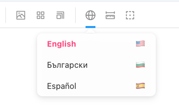
Now that we have Transloco integrated into our component stories, we would like to change the default language and see how components render in all supported languages. Storybook provides a way to extend its global toolbar by allowing us to append custom controls that can pass values to our components.
Open the .storybook/preview.js again and append the following code snippet:
// add these imports at the top
import {
  DEFAULT_LANGUAGE,
  SUPPORTED_LANGUAGES,
} from "./../src/app/transloco/supported-languages"

// add this at the bottom
export const globalTypes = {
  // adds a custom dropdown menu in the Storybook UI toolbar
  language: {
    name: "Language",
    description: `Choose a language`,
    defaultValue: DEFAULT_LANGUAGE.code,
    toolbar: {
      icon: "globe",
      items: SUPPORTED_LANGUAGES.map(language => ({
        value: language.code,
        right: language.icon,
        title: language.title,
      })),
    },
  },
}
This creates a new dropdown button in the Storybook's toolbar which allows selecting one of the supported languages with a default value equaling the default Transloco language.
If you change the language from the dropdown, you will see that our component still renders the text in English. The reason is that Transloco isn't notified about the language selection and doesn't know that it needs to re-render the component.
Syncing the Storybook's language selector with Transloco
To change the application's language in Transloco we must call
TranslocoService.setActiveLang() with the chosen language's code. The question
is how to hook into the Storybook's language picker value changes? There aren't
events that we can listen to, instead Storybook stores the value users pick in a
globals object and then calls the story function again and passes the
globals as part of the arguments. In the React world that would be the same as
passing it as props to the story's wrapper component.
// Somewhere in Storybook's TypeScript definitions:
export declare type StoryContext = StoryIdentifier & {
  [key: string]: any
  parameters: Parameters
  args: Args
  argTypes: ArgTypes
  globals: Args
  hooks?: HooksContext
  viewMode?: ViewMode
  originalStoryFn?: ArgsStoryFn
}

// The signature of a Storybook story rendering function.
// We're interested in the second parameter.
function Story<T>(args: Args<T>, params: StoryContext): StoryFnAngularReturnType
We can find the selected language by accessing params.globals.language.
Now that we know how Storybook passes along the global state, we can create a
custom story wrapper function. Add this snippet at the end of the
transloco-storybook.module.ts file.
export const TranslocoStory: Story = (args, { globals, ...rest }) => {
  if (globals.language) {
    // TODO: get reference to the TranslocoService instance
    translocoServiceInstance?.setActiveLang(globals.language)
  }

  return {
    globals,
    props: {
      ...args,
    },
    ...rest,
  }
}
Our custom story function enhances the default behavior by checking the selected
language and syncing it with the TranslocoService. We also make sure to pass
through all other arguments that we don't care about. Storybook guarantees that
it will invoke this function each time the user selects a value from the
language picker in the toolbar. This is how our story will look like after we
incorporate our new TranslocoStory function:
import { Meta } from "@storybook/angular"
import { TranslocoStory } from "../../transloco/transloco-storybook.module"
import { EvilCorpStatusBadgeComponent } from "./evil-corp-status-badge.component"

export default {
  title: "Components/EvilCorpStatusBadge",
  component: EvilCorpStatusBadgeComponent,
} as Meta

export const Processing = TranslocoStory.bind({})
Processing.args = {
  status: "processing",
}

export const Success = TranslocoStory.bind({})
Success.args = {
  status: "success",
}

export const Error = TranslocoStory.bind({})
Error.args = {
  status: "error",
}
The last step left is to make TranslocoService accessible from a
TranslocoStory. Now is the perfect time to get familiar with the lifecycle of
our Angular stories. What happens when you open a story for a component is:
- Storybook bootstraps a new Angular application using the module configuration
provided in the
preview.jsfile'smoduleMetadata()function call combined with the story specific metadata. - Angular instantiates the current component and initializes it
(
constructor()andngOnInit()get called). - If users navigate away to another story, the whole Angular application gets destroyed and re-created for the new newly visited component (the bootstrap process repeats).
The easiest way get hold of a reference to the TranslocoService instance is
hooking into the "application bootstrap" process with a so called initializer
factory function. We can do this by providing an APP_INITIALIZER token in the
list of providers in our TranslocoStorybookModule:
@NgModule({
  // ...
  providers: [
    // ...
    {
      provide: APP_INITIALIZER,
      useFactory: translocoStorybookInitializer, // our initializer hook
      multi: true,
      deps: [TranslocoService], // the dependencies that Angular passes as arguments to our hook
    },
  ],
})
export class TranslocoStorybookModule {}
Angular injects a list of services (deps) as arguments to this function. We
will use that option to inject TranslocoService and store its reference. Our
factory function must return another function that Angular will call during the
bootstrapping. We must define this function somewhere above the
TranslocoStorybookModule class and we also have to declare a variable for
storing reference to the TranslocoService.
let translocoServiceInstance: TranslocoService | null = null

export function translocoStorybookInitializer(
  translocoService: TranslocoService
) {
  return () => {
    // stores the reference to the service
    translocoServiceInstance = translocoService
  }
}
Now we can reference translocoServiceInstance in our custom story wrapper
function (TranslocoStory) that we declared above.
If you try to change the language, you will notice that the component doesn't
re-render its text to match the newly chosen language. The problem is that we
call translocoService.setActiveLang() outside of the application's NgZone
and change detection isn't triggered automatically. To avoid this shortcoming we
can subscribe to language changes in the initializer hook and manually call
Storybook's forceReRender() which as its name says will re-render the story
component.
This is how our final version of the translocoStorybookInitializer function
looks like:
export function translocoStorybookInitializer(
  translocoService: TranslocoService
) {
  return () => {
    translocoServiceInstance = translocoService

    translocoService.langChanges$
      .pipe(
        distinctUntilChanged(),
        tap(() => forceReRender())
      )
      .subscribe()
  }
}
The Angular components inside Storybook will re-render after each language
change as originally expected. In application code we would like to clean up any
Observable subscriptions, but since this is a development environment, that's
not strictly necessary.
That's it, we've achieved our initial goal to change the Angular components' language at runtime via the Storybook UI. You can use the same techniques to extend Storybook even further and customize it to your teams' specific needs.