If you have ever developed a React Native application which renders images from the web, you have probably seen the effect of the image view being transparent while the content is downloading from the network and then appearing out of nowhere. This looks ugly and does not provide a good user experience. You can see the undesired content flash when displaying this list of user avatars:
We can improve the default behavior by using the defaultSource property on the
Image element. It allows us to render a static image (loaded from the file
system) to display while downloading the dynamic image off the network. Let's
add a static placeholder avatar and see the results.
const avatarPlaceholderImg = require("./assets/avatar-placeholder.png")

const Avatar = ({ userId, size }) => {
  return (
    <Image
      style={{ width: size, height: size, borderRadius: size / 2 }}
      defaultSource={avatarPlaceholderImg}
      source={{
        uri: `https://example.com/avatar?size=${size}&user_id=${userId}`,
      }}
      width={size}
      height={size}
    />
  )
}
This solution is simple and works well in this case. This is not the optimal solution though - displaying one and the same placeholder image can sometimes ruin a great design.
There are situations where it's better to display dynamic placeholders which contain colors from or closer approximations of the original image. Suitable image types for this strategy are album art, book covers and photographs. This more advanced strategy allows for a smoother transition between the placeholder and the actual image. Platforms like Twitter, Unsplash, Medium and Mastodon use these effects.
What we are building
Let's create two advanced image placeholder components consisting of:
- linear gradient with two "dominant colors" from the original image
- "blurhash" - simplified blurred version of the original image encoded as a short string
We will also add a fade-in effect for smoother transition between placeholder
and image using React Native's
Animated library.
To show the advantages of advanced image fallbacks we will build a single screen from a music app which displays artists and their albums.
I've compiled some music artists' data which will simulate a response received from a REST API. I defined the dominant colors and generated the blurhashes for each of the album covers - in a real-world scenario your back-end service should automatically do these calculations at the time of image upload.
Prerequisites
Let's create a new React Native application with TypeScript support which will house our components. Open a terminal and execute the following command:
npx react-native init BeautifulImagePlaceholdersApp --template react-native-template-typescriptThis creates a project with these main dependencies at the time of writing:
react-native: 0.63.3react: 16.13.1typescript: 3.8.3
Linear and radial gradients aren't supported in React Native core. To render
views with gradient backgrounds we must install an external package called
react-native-linear-gradient.
Navigate to the newly created project's directory
BeautifulImagePlaceholdersApp and run:
npm i react-native-linear-gradientFor the blurhash decoding we can take advantage of an awesome port for React
Native called
react-native-blurhash. It
provides a component which renders blurhash strings as images.
npm i react-native-blurhashThe last step is to install the native iOS dependencies (Cocoapods) which are part of these external packages.
npx pod-installNow we are ready to build and run the application on a device or simulator/emulator.
npx react-native run-ios # iOSnpx react-native run-android # AndroidGradient image placeholder
Create a new component called GradientPlaceholderImage.tsx in the components
folder (which does not exist yet):
mkdir -p components && touch components/GradientPlaceholderImage.tsximport React from "react"
import {
Animated,
Easing,
ImageProps,
StyleSheet,
View,
ViewStyle,
} from "react-native"
import LinearGradient from "react-native-linear-gradient"
interface Props extends ImageProps {
colors: string[]
width: number
height: number
angle?: number
containerStyle?: ViewStyle
}
const GradientPlaceHolderImage: React.FC<Props> = props => {
const {
colors,
angle = 15,
width,
height,
containerStyle,
...imageProps
} = props
const [isFadeInFinished, toggleFadeInFinished] = React.useState(false)
const imageDimensions = { width, height }
const animatedOpacityValue = React.useRef(new Animated.Value(0)).current
return (
<View style={containerStyle}>
{!isFadeInFinished && (
<LinearGradient
colors={colors}
style={[styles.gradient, imageDimensions, imageProps.style]}
useAngle
angle={angle}
/>
)}
<Animated.Image
{...imageProps}
{...imageDimensions}
style={[
imageDimensions,
imageProps.style,
{ opacity: animatedOpacityValue },
]}
onLoad={e => {
if (typeof imageProps.onLoad === "function") {
imageProps.onLoad(e)
}
if (isFadeInFinished) {
return
}
Animated.timing(animatedOpacityValue, {
toValue: 1,
delay: 0,
isInteraction: false,
useNativeDriver: true,
easing: Easing.in(Easing.ease),
}).start(() => toggleFadeInFinished(true))
}}
/>
</View>
)
}
const styles = StyleSheet.create({
gradient: {
position: "absolute",
left: 0,
top: 0,
},
})
export default GradientPlaceHolderImageThe component accepts all properties of the original React Native Image
component as well as colors and an angle in degrees for the gradient fallback.
Users of the component must provide the exact size of the image element to allow
the gradient fallback to match the dimensions of the image by passing the
width and height props.
The gradient view is absolutely positioned under the image element. Since the image has a transparent background while it's loading, the gradient below renders on the screen instead.
We animate the image to fade into the gradient so that the transition between
the placeholder and the image itself looks more natural. We use Animated.Image
which allows us to pass Animated.Value objects as props. To achieve the
desired fade-in effect we animate the opacity style prop of the image from 0
to 1 (transparent to opaque).
Because GradientPlaceHolderImage is a functional component, there is a subtle
catch - we save the Animated.Value instance as a reference by using
React.useRef(). If we don't do so, we will get a new instance of
Animated.Value on each re-render and our animation won't behave as expected.
In a React class component, we could achieve the same by storing the animated
value in field:
  constructor(props) {
    super(props)
    this.animatedVal = new Animated.Value(0)
  }
After the image has finished loading we trigger the fade in animation by calling
Animated.timing() with our animated opacity value. This will animate a given
value over time with an easing function - a mathematical function which
simulates realistic value changes in a given time interval. We provide
Easing.in(Easing.ease) as the easing function and 1 as the desired final
value after the animation finishes. When the transition completes, we remove the
gradient fallback element from the view and the image remains the single view
rendered by the component.
Putting GradientPlaceHolderImage into use
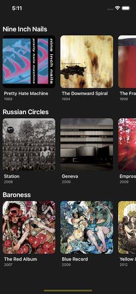
Let's see our fancy component in action by creating a Spotify-like list of artists and their albums. This scenario will require loading many artwork images and displaying them in a virtualized list - a perfect use-case to check the effectiveness of our component!
Start by creating a file which holds artists and albums data that we are going to render:
touch artists.tsCopy the following contents into the newly created file:
export interface MusicAlbum {
  name: string
  year: number
  artwork: {
    url: string
    dominantColors: [string, string]
    blurhash: string
  }
}

export interface MusicArtist {
  name: string
  albums: MusicAlbum[]
}

// adds a fake query parameter to the image URL
// so that it's always fetched form network and not from cache
const artUrl = (path: string) =>
  `https://coverartarchive.org/release/${path}.jpg?${new Date()}`

const artists: MusicArtist[] = [
  {
    name: "Nine Inch Nails",
    albums: [
      {
        name: "Pretty Hate Machine",
        year: 1989,
        artwork: {
          url: artUrl("60a04a88-3956-49f5-9d0f-b2603be9f612/8270653258-500"),
          dominantColors: ["#d0498e", "#2d85b0"],
          blurhash: "UKC6~3T#W9rqK5S#X8ay9rS1r?r?w|#SWASg",
        },
      },
      {
        name: "The Downward Spiral",
        year: 1994,
        artwork: {
          url: artUrl("dceb6a01-3431-36af-b2e1-6462193bd67c/2196400361-500"),
          dominantColors: ["#dac47f", "#bea06d"],
          blurhash: "UVOMZftnxvog~o.8o#M}MyxXRQtQD*IUf5t6",
        },
      },
      {
        name: "The Fragile",
        year: 1999,
        artwork: {
          url: artUrl("ed2fe058-a25c-4bd0-b5ff-9a0f7661ad92/17884561006-500"),
          dominantColors: ["#4d4a55", "#ac2730"],
          blurhash: "URLBz#02ypR7Q7Vrxbs.cZova1oz%#RQofWB",
        },
      },
      {
        name: "With Teeth",
        year: 2005,
        artwork: {
          url: artUrl("44cbff72-9db6-4ad0-b4c8-b14986afc93a/10150118074-500"),
          dominantColors: ["#42455d", "#e6ebf0"],
          blurhash: "U-KUpBt7xuay~qWAt7fRIURjWBfRbcogRjay",
        },
      },
      {
        name: "Ghosts I-IV",
        year: 2008,
        artwork: {
          url: artUrl("a6db272a-22e6-485d-8d6b-e6d7f469a08c/15668674653-500"),
          dominantColors: ["#20231d", "#87887a"],
          blurhash: "UADl~2M|00t700t7~pWB~qRjNFof?uxuM{WB",
        },
      },
      {
        name: "The Slip",
        year: 2008,
        artwork: {
          url: artUrl("e292c47a-49d6-3b11-88f9-9938e77fd15b/4099941150-500"),
          dominantColors: ["#0d0d0d", "#6b2f2f"],
          blurhash: "UA9%n@of00j[eTIUxu-;00of~qWBx]-;IU00",
        },
      },
    ],
  },
  {
    name: "Russian Circles",
    albums: [
      {
        name: "Station",
        year: 2008,
        artwork: {
          url: artUrl("89c525d5-ba1a-448e-ade0-6617ce47eea7/5930134505-500"),
          dominantColors: ["#32302b", "#a7a6a4"],
          blurhash: "UKCP*Fayxuay~qofofWB-;t7ayWB%MWBWBay",
        },
      },
      {
        name: "Geneva",
        year: 2009,
        artwork: {
          url: artUrl("acac3cdb-ccd5-3736-87b3-1554de5a83be/3331811954-500"),
          dominantColors: ["#7f756d", "#181511"],
          blurhash: "UBA^5n%2Rj%L~WNGR*of4:M{t7NGM}of%2WB",
        },
      },
      {
        name: "Empros",
        year: 2009,
        artwork: {
          url: artUrl("65bc450d-2304-47d9-b114-e84b8bc56811/3331814020-500"),
          dominantColors: ["#dd3446", "#952530"],
          blurhash: "UjJ~1Y%25QWB}[t7NHoLEzW;xuofVtaytRkC",
        },
      },
      {
        name: "Memorial",
        year: 2013,
        artwork: {
          url: artUrl("14e2923f-2344-4d4c-9d24-02d18245412d/5929733555-500"),
          dominantColors: ["#1e334b", "#020b21"],
          blurhash: "U4A1P1ju00xvY8t8?bITD%flI9s:00%g-=bI",
        },
      },
      {
        name: "Guidance",
        year: 2016,
        artwork: {
          url: artUrl("ae8d42ac-58da-4dc1-974a-0c98c0a8640e/14303151485-500"),
          dominantColors: ["#cbd5d4", "#591d21"],
          blurhash: "UFH_Y|.8M{x]4TMxbHx]_NWVkCt700ayofRP",
        },
      },
    ],
  },
  {
    name: "Baroness",
    albums: [
      {
        name: "The Red Album",
        year: 2007,
        artwork: {
          url: artUrl("d5526d95-9288-4f45-ac86-9ff465792ecb/1369815832-500"),
          dominantColors: ["#e32244", "#dc6eaf"],
          blurhash: "U9Hm+RyCM{tkLz=zJ7%gQ=?ut7EM.8k?S#rE",
        },
      },
      {
        name: "Blue Record",
        year: 2009,
        artwork: {
          url: artUrl("c3fcab28-de11-4501-8ef8-131620b62bc7/9561609511-500"),
          dominantColors: ["#73aaad", "#0d66b1"],
          blurhash: "U7GI$F-g0102D#x|ETEf0O.8$y-O_2NGD+WF",
        },
      },
      {
        name: "Yellow & Green",
        year: 2012,
        artwork: {
          url: artUrl("2f14078e-cc9a-44c4-ac66-78dc4d182235/25038495680-500"),
          dominantColors: ["#56483b", "#edd445"],
          blurhash: "UXJ@jwNGWBsk~o-mR,M{?FNGxsRkozoHWCbI",
        },
      },
      {
        name: "Purple",
        year: 2015,
        artwork: {
          url: artUrl("cca4e60e-66cf-43aa-91be-6e07f980b328/15332374250-500"),
          dominantColors: ["#cb9db8", "#6755b8"],
          blurhash: "U8H^^~=yEFbx.AEm4]$*tC9ZIc%MELn,RW%2",
        },
      },
      {
        name: "Gold & Grey",
        year: 2019,
        artwork: {
          url: artUrl("352a670e-d7dc-4d7b-a8b1-2b28def1f63b/23323216427-500"),
          dominantColors: ["#4e524d", "#ea972e"],
          blurhash: "U9Mhxs}@Djzp1~%K.7VX-nEgIoR%KjRQa1WB",
        },
      },
    ],
  },
]

export default artists
The file contains a sample object with music artists and their albums. I've manually went through the artworks and chose the "dominant" colors which we will use for the image placeholder gradients.
Now open the App.tsx file and replace its contents with the following:
import React from "react"
import {
  FlatList,
  ListRenderItemInfo,
  SafeAreaView,
  ScrollView,
  StatusBar,
  StyleSheet,
  Text,
  View,
} from "react-native"
import artists, { MusicAlbum } from "./artists"

import GradientPlaceholderImage from "./components/GradientPlaceholderImage"

const ARTWORK_SIZE = 160
const BG_COLOR = "#212121"

function renderAlbumListItem(listItem: ListRenderItemInfo<MusicAlbum>) {
  const { item: album } = listItem

  return (
    <View style={{ maxWidth: ARTWORK_SIZE, marginHorizontal: 8 }}>
      <GradientPlaceholderImage
        key={album.name + album.year}
        source={{
          uri: album.artwork.url,
        }}
        width={ARTWORK_SIZE}
        height={ARTWORK_SIZE}
        colors={album.artwork.dominantColors}
        style={{ borderRadius: 10 }}
      />
      <Text style={styles.albumTitleText}>{album.name}</Text>
      <Text style={styles.albumYearText}>{album.year}</Text>
    </View>
  )
}

function getAlbumListItemLayout(_: any, index: number) {
  return {
    length: ARTWORK_SIZE,
    offset: index * ARTWORK_SIZE,
    index,
  }
}

const App = () => {
  return (
    <>
      <SafeAreaView style={{ backgroundColor: BG_COLOR, flex: 1 }}>
        <StatusBar barStyle="light-content" backgroundColor="#222" />
        <ScrollView
          contentInsetAdjustmentBehavior="automatic"
          contentContainerStyle={{ paddingVertical: 12 }}
        >
          {artists.map(artist => (
            <View key={artist.name}>
              <Text style={styles.artistText}>{artist.name}</Text>
              <FlatList
                horizontal={true}
                data={artist.albums}
                renderItem={renderAlbumListItem}
                keyExtractor={album => album.name}
                getItemLayout={getAlbumListItemLayout}
                windowSize={1}
                initialNumToRender={3}
                maxToRenderPerBatch={3}
              />
            </View>
          ))}
        </ScrollView>
      </SafeAreaView>
    </>
  )
}

const styles = StyleSheet.create({
  artistText: {
    fontSize: 20,
    fontWeight: "600",
    color: "#fefefe",
    marginTop: 16,
    marginBottom: 8,
    paddingLeft: 8,
  },
  albumTitleText: {
    fontSize: 14,
    fontWeight: "500",
    color: "#ececec",
    paddingTop: 8,
    paddingHorizontal: 4,
  },
  albumYearText: {
    fontSize: 11,
    fontWeight: "300",
    color: "#bababa",
    paddingHorizontal: 4,
    paddingTop: 2,
    paddingBottom: 4,
  },
})

export default App
For each artist we are rendering a horizontal FlatList which contains the
artist's albums. Each list item renders the album artwork, title and release
date.
The renderAlbumListItem function encapsulates the rendering logic for each
album. For performance reasons it's essential to declare it outside the
component which renders the FlatList (or memoize it using
React.useCallback). If we forget doing so, the function reference will change
on each re-render and thus trigger a re-render for the FlatList itself and
this can be expensive! In our case this is more of a precaution because the
App component is the top-level one and it's not supposed to get re-rendered a
lot.
Another interesting function is getAlbumListItemLayout - it allows us to
improve the list scrolling performance by calculating what dimensions each list
item has upfront. In this way the FlatList does not have to dynamically
measure the width and height of each list item it's going to render. We can only
apply this optimization if all our list items have the same height (for vertical
lists) or width (for horizontal lists). In our case the max width of each album
list item component is equal to ARTWORK_SIZE.
App component renders a ScrollView which contains a horizontal FlatList
for each artist. To take advantage of the fact that we provide a custom
getItemLayout function and we know the size of each element upfront, we can
set the following properties:
windowSize- how many "scrolling screens" should the list renderinitialNumToRender- how many list items should be rendered before the user scrolls the listmaxToRenderPerBatch- how many list items should be rendered when the user reaches the end of the list to fill it with new content
On most mobile phone screens users can see 3 album components at once - so
setting initialNumToRender and maxToRenderPerBatch to 3 is a sensible
value. We set windowSize to 1 which means we don't want the list to
pre-render off screen content - this will help us to test our image fallback
because we will always have images loading at the moment when we scroll the
lists. For a better UX it's better to pre-render a few screens ahead of time so
that users don't see blank spaces or loading indicators when they scroll.
However, our goal is to see the GradientPlaceholderImage component we built in
action and lazy rendering makes it easier to observe its behavior.
Let's see what we built so far:
As you can see, a colorful gradient renders before an album artwork loads. There's also a fade-in effect which makes the transition between placeholder and actual image smooth and gracious.
Blurhash placeholder image implementation
Let's now create a component which renders a blurhash as a placeholder for an image.
touch components/GradientPlaceholderImage.tsximport React from "react"
import {
Animated,
Easing,
ImageProps,
StyleSheet,
View,
ViewStyle,
} from "react-native"
import { Blurhash } from "react-native-blurhash"
interface Props extends ImageProps {
width: number
height: number
blurhash: string
containerStyle?: ViewStyle
}
const BlurHashPlaceholderImage: React.FC<Props> = ({
blurhash,
width,
height,
containerStyle,
...imageProps
}) => {
const [isFadeInFinished, toggleFadeInFinished] = React.useState(false)
const imageDimensions = { width, height }
const animatedOpacityValue = React.useRef(new Animated.Value(0)).current
return (
<View style={containerStyle}>
{!isFadeInFinished && (
<Blurhash
blurhash={blurhash}
style={[styles.blurhash, imageDimensions, imageProps.style]}
/>
)}
<Animated.Image
{...imageProps}
{...imageDimensions}
style={[
imageDimensions,
imageProps.style,
{ opacity: animatedOpacityValue },
]}
onLoad={e => {
if (typeof imageProps.onLoad === "function") {
imageProps.onLoad(e)
}
if (isFadeInFinished) {
return
}
Animated.timing(animatedOpacityValue, {
toValue: 1,
delay: 0,
isInteraction: false,
useNativeDriver: true,
easing: Easing.in(Easing.ease),
}).start(() => toggleFadeInFinished(true))
}}
/>
</View>
)
}
const styles = StyleSheet.create({
blurhash: {
position: "absolute",
left: 0,
top: 0,
},
})
export default BlurHashPlaceholderImageThis time instead of colors and gradient angle our component accepts a
blurhash prop. The original Blurhash component accepts additional props
which we aren't going to cover and expose as part of our public API. The rest of
the implementation is the same as GradientPlaceholderImage.
To test our new component go to App.tsx, import the component and replace the
references to the old one with it.
import BlurHashPlaceholderImage from './components/BlurHashPlaceholderImage'

...

function renderAlbumListItem(listItem: ListRenderItemInfo<MusicAlbum>) {
  const {item: album} = listItem;

  return (
    <View style={{maxWidth: ARTWORK_SIZE, marginHorizontal: 8}}>
      <BlurHashPlaceholderImage
        key={album.name + album.year}
        source={{
          uri: album.artwork.url,
        }}
        width={ARTWORK_SIZE}
        height={ARTWORK_SIZE}
        blurhash={album.artwork.blurhash}
        style={{borderRadius: 10}}
      />
      <Text style={styles.albumTitleText}>{album.name}</Text>
      <Text style={styles.albumYearText}>{album.year}</Text>
    </View>
  );
}
The result should look like this:
The blurhash placeholder resembles the real image even more accurately than before.
Refactoring our solution to improve code quality
Now that we made sure our placeholder components work as expected, let's take care of improving our code.
Extract the fade-in animation effect into a custom React hook
In both components we use the same fade in animation by duplicating (copy/pasting) the instructions needed for it. In this way we break the DRY principle. Let's extract our duplicated business logic into a React hook.
Create a new hooks folder and a new TypeScript file called
useFadeInAnimation.ts:
mkdir -p hooks && touch ./hooks/useFadeInAnimation.tsimport React, { useCallback } from "react"
import { Animated, Easing } from "react-native"
export function useFadeInAnimation(fadedInCallback?: () => void) {
const [isFadeInFinished, toggleFadeInFinished] = React.useState(false)
const animatedOpacityValue = React.useRef(new Animated.Value(0)).current
const startFadeIn = useCallback(() => {
if (!isFadeInFinished) {
Animated.timing(animatedOpacityValue, {
toValue: 1,
delay: 0,
isInteraction: false,
useNativeDriver: true,
easing: Easing.in(Easing.ease),
}).start(() => {
toggleFadeInFinished(true)
if (typeof fadedInCallback === "function") {
fadedInCallback()
}
})
}
}, [isFadeInFinished, animatedOpacityValue, fadedInCallback])
return {
fadedIn: isFadeInFinished,
opacity: animatedOpacityValue,
startFadeIn,
}
}Our custom hooks encapsulate all the implementation details for the fade-in
animation. The hook returns the same values which we already use in our
placeholder components while hiding the tricky internals - e.g. users of the
hook don't have to store the animated value in a useRef() anymore. Callers can
also provide a callback function which gets invoked once the animation has
finished.
Let's go to BlurHashPlaceholderImage.tsx and simplify the code by importing
our custom hook:
// ...
import { useFadeInAnimation } from "../hooks/useFadeInAnimation"
// ...

const BlurHashPlaceholderImage: React.FC<Props> = ({
  blurhash,
  width,
  height,
  containerStyle,
  ...imageProps
}) => {
  const { fadedIn, opacity, startFadeIn } = useFadeInAnimation()
  const imageDimensions = { width, height }

  return (
    <View style={containerStyle}>
      {!fadedIn && (
        <Blurhash
          blurhash={blurhash}
          decodeAsync={true}
          style={[styles.blurhash, imageDimensions, imageProps.style]}
        />
      )}
      <Animated.Image
        {...imageProps}
        {...imageDimensions}
        style={[imageDimensions, imageProps.style, { opacity }]}
        onLoad={e => {
          if (typeof imageProps.onLoad === "function") {
            imageProps.onLoad(e)
          }
          startFadeIn()
        }}
      />
    </View>
  )
}
See how much more elegant and simple our component implementation looks! You can also use this hook in other components which require similar animation effect.
Move shared styles into their own file
We can go even further by moving the component styles into a separate file. The styles sheet rules are the same for both image placeholder components.
touch components/ImagePlaceholder.styles.tsimport { StyleSheet } from "react-native"
const ImagePlaceholderStyles = StyleSheet.create({
placeholder: {
position: "absolute",
left: 0,
top: 0,
},
})
export default ImagePlaceholderStylesI renamed the blurhash/gradient style property to the more generic
placeholder so that it makes sense for both contexts.
Now we can edit our components and replace the initialization of the
StyleSheet object with a reference to our shared object:
import ImagePlaceholderStyles from "./ImagePlaceholder.styles"

// ...
return (
  // ...
  <Blurhash
    //..
    style={[styles.placeholder, imageDimensions, imageProps.style]}
  />
  // ...
)
// ...

const styles = ImagePlaceholderStyles
Define common props interface
Some React props are shared between the two components that we created. We can
define this relationship using TypeScript interfaces. Create a file called
types.ts and enter the following interface definitions:
import { ImageProps, ViewStyle } from "react-native"

export interface GradientPlaceholderImageProps extends ImagePlaceholderProps {
  colors: string[]
  angle?: number
}

export interface BlurHashPlaceholderImageProps extends ImagePlaceholderProps {
  blurhash: string
}

/**
 * Common props shared for both components.
 */
export interface ImagePlaceholderProps extends ImageProps {
  width: number
  height: number
  containerStyle?: ViewStyle
}
Now you can replace the props interfaces declared inside the components with these new definitions. The common interface might be useful in the future, if you want to create a similar component.
Conclusion
I hope these image placeholders will be useful for your React Native application! You can find the full source code on GitHub.